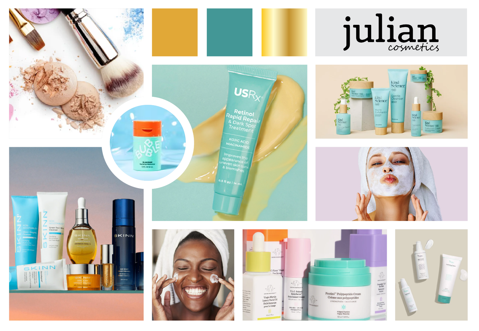
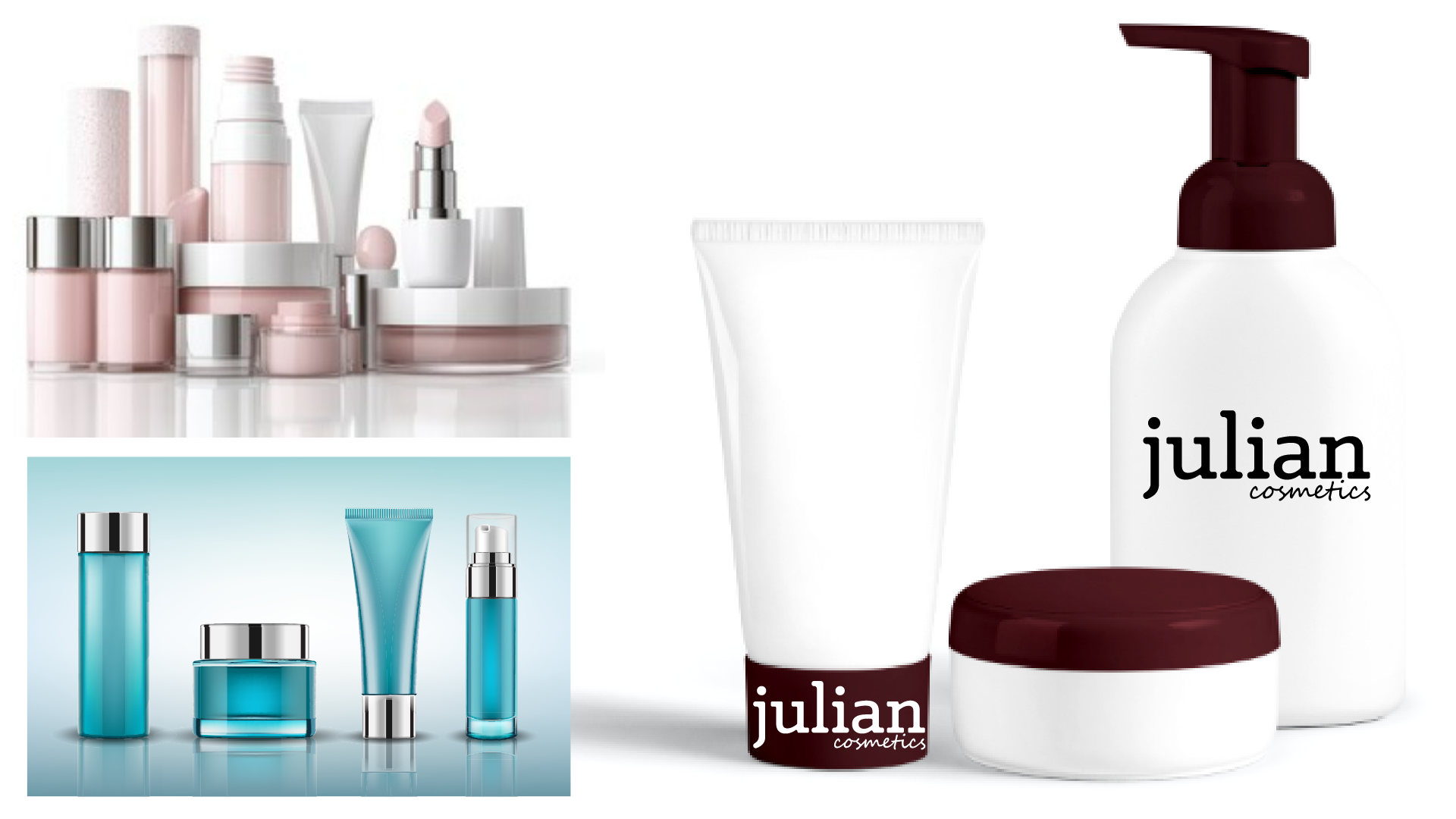
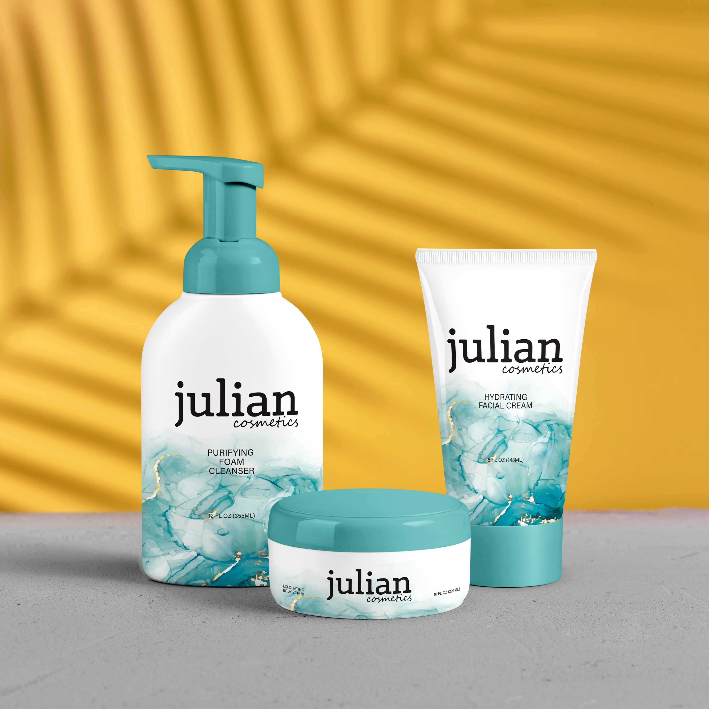
Julian Cosmetics

Category: Product Packaging

The Challenge: Create a skincare brand that appeals to both teens and adults, balancing playful energy with a sense of sophistication and trust.

About the Project

Julian Cosmetics is a contemporary skincare brand centered on clean, effective formulations and effortless daily rituals. The brand embraces simplicity and balance, combining modern minimalism with subtle artistic detail.

Its identity is rooted in freshness, clarity, and accessibility, offering products that feel both elevated and approachable. With a focus on hydration and skin health, Julian Cosmetics positions itself as a brand that grows with its audience.

Julian Cosmetics Logo

Visual Strategy

With the brand name and typographic direction established, the focus shifted to creating a packaging system that could bridge two distinct audiences. The goal was to design something visually engaging and fresh for teens, yet polished and elevated enough to feel credible to adults.

I considered how skincare packaging communicates trust, especially for younger consumers. The design needed to feel welcoming and modern without appearing overly trendy or juvenile. The soft teal watercolor texture introduces movement and energy, subtly attracting a younger demographic, while the clean white base and minimalist typography maintain sophistication.

Emphasis was placed on color balance, negative space, and clear hierarchy to ensure the logo remained the focal point across bottles, tubes, and jars. The intention was to create packaging that feels expressive, yet timeless enough to grow with the consumer.

Julian Cosmetics Visual Strategy
Julian Packaging Development

Packaging Development

The packaging system was developed to maintain visual consistency across multiple formats, including a pump bottle, squeeze tube, and cream jar. Each structure was selected with usability in mind, ensuring accessibility and convenience for a wide age range.

The white foundation reinforces cleanliness and clarity, while the teal and subtle gold accents create contrast and visual interest. The watercolor texture acts as a unifying element across all formats, strengthening brand recognition and shelf impact.

Careful attention was given to scale and placement to maintain a strong logo presence without overwhelming the design. Product information remains clear and organized, reinforcing trust and functionality for both new and experienced skincare users.

Final Execution

The final packaging design delivers a cohesive and versatile skincare system that successfully bridges generations. It feels approachable and engaging for teens while maintaining the elegance and credibility that appeals to adult consumers.

The result is a unified product line that enhances shelf presence, strengthens brand recognition, and reflects Julian Cosmetics’ commitment to accessible, modern skincare for all ages.

Final Product Showcase

Final Skincare Product Image