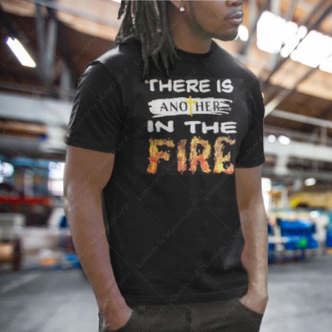
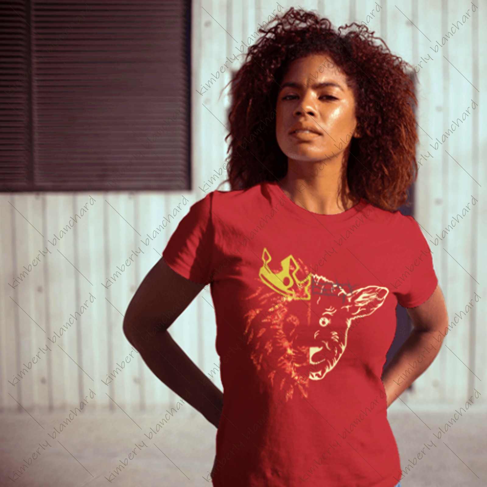
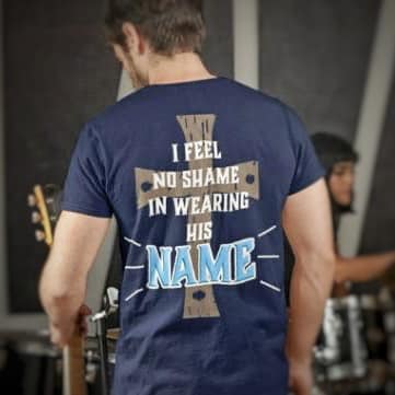
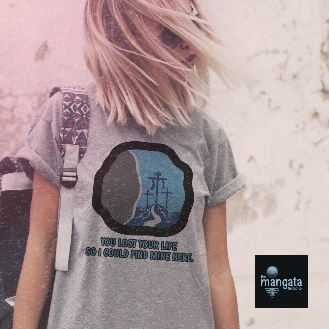
The Mangata Thread Company

Category: Graphic Design & Product Execution

The Challenge: Create a cohesive, modern faith-based brand that moves beyond traditional retail aesthetics.

About the Project

The Mangata Thread Company is a faith-based apparel and lifestyle brand created to offer thoughtfully designed pieces that feel modern, elevated, and design-forward. Founded and developed entirely in-house, the brand reflects my personal aesthetic and creative voice while redefining what faith-centered products can look like.

The name Mangata, meaning “the reflection of the moon on water,” represents light in darkness, subtle beauty, and quiet strength. Each product is intentionally designed and produced to feel meaningful without leaning into cliché visuals.

Mangata Thread Co Logo
Visual Strategy and Product Direction

Visual Strategy

The visual direction centered on minimalism, clean typography, and subtle symbolism. Rather than relying on overt religious imagery, the brand uses refined layouts, balanced spacing, and intentional messaging to communicate faith in a contemporary way.

Color palettes were chosen to feel neutral and wearable, allowing the designs to integrate seamlessly into everyday life. Typography plays a central role, with hierarchy and spacing guiding the emotional tone of each piece. The goal was to create products that feel stylistically aligned with modern lifestyle brands while still holding spiritual meaning.

Design Development

Because this brand was self-initiated, development involved experimenting with multiple design directions before refining a cohesive collection. Early concepts tested varying levels of symbolism and scriptural references, gradually narrowing into designs that felt subtle yet impactful.

Attention was given to scalability across products, ensuring each graphic translated effectively from apparel to decals, mugs, and tumblers. Production considerations also influenced design decisions, from print placement to material compatibility. Each piece was refined to maintain clarity, legibility, and visual balance across formats.

Design Development and Production

Final Execution

The final collection reflects a unified brand identity carried across apparel and lifestyle products. Each piece maintains a consistent visual language rooted in simplicity and intentional typography. As one of my earliest branding projects, it represents an important stage in my growth as a designer.

While the current identity established the foundation, I plan to revisit and refine the logo with my developed technical skills. Rebranding it with a more elevated mark is something I look forward to, allowing the visual identity to better reflect the quality and intention behind the products.

Product Collection Showcase

Product Showcase
Product Showcase
Product Showcase
Product Showcase
Product Showcase
Product Showcase