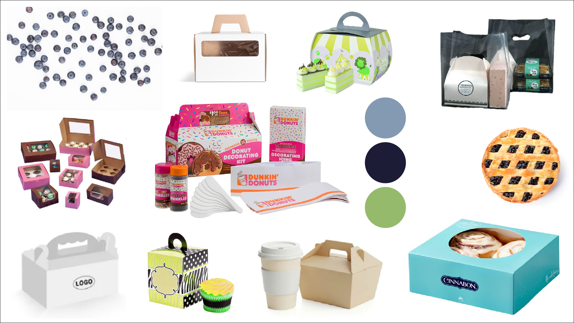
Packaging Development
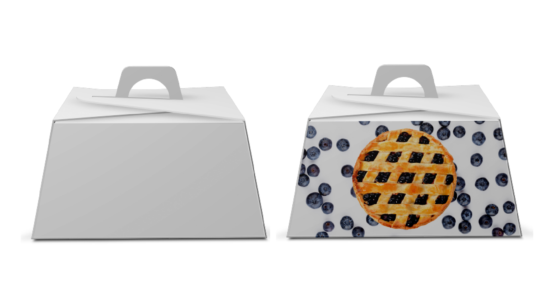
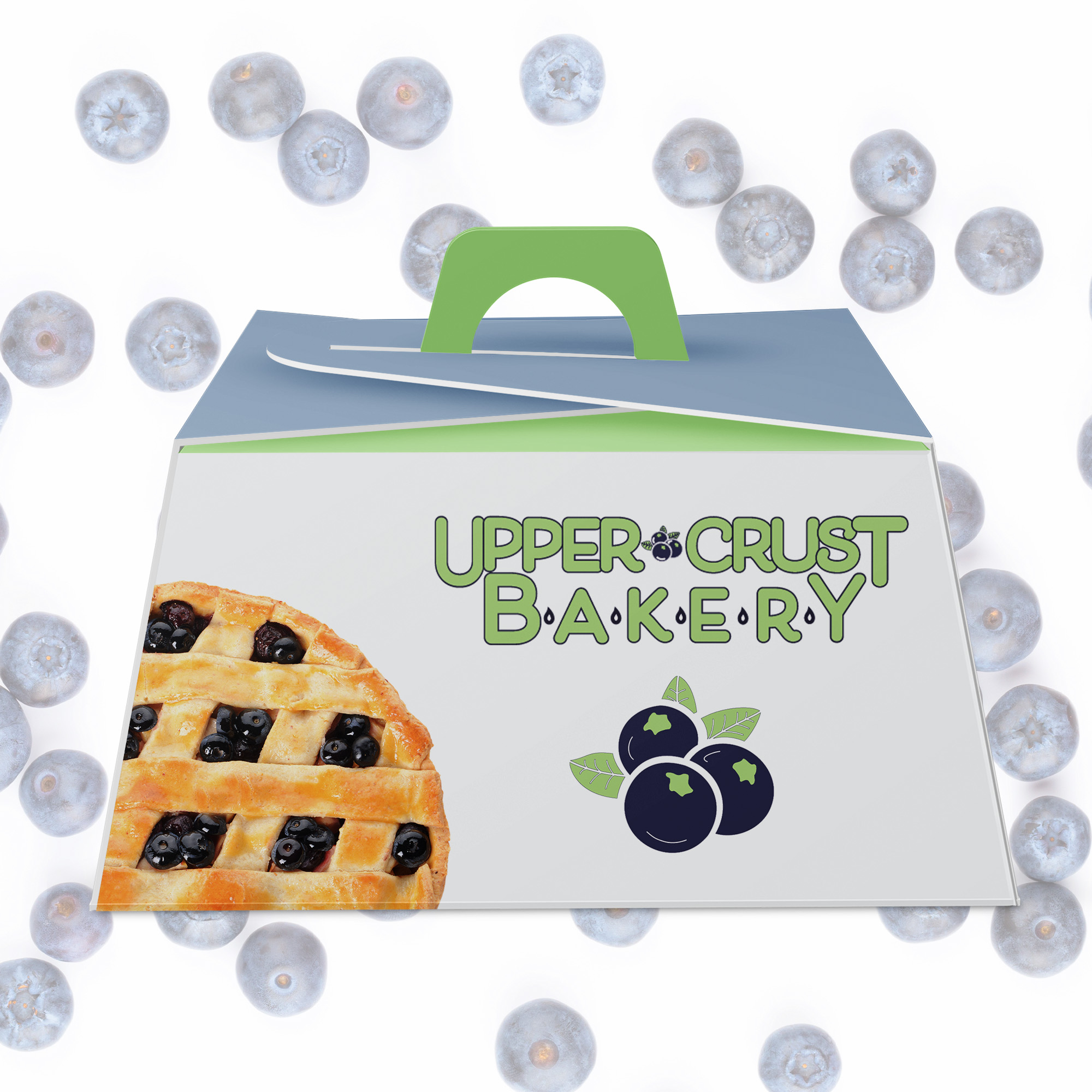
The box structure was designed with both practicality and visual presence in mind. A built-in handle allows for easy transport, while the angled top creates dimension and visual interest. The brand’s green and blue tones were extended across the structural elements, creating contrast between the exterior surfaces and interior folds.
The front panel prominently features the Upper Crust Bakery logo, paired with a blueberry icon to reinforce product association. A cropped image of a lattice pie was incorporated to add warmth and realism without overwhelming the composition. This balance between illustration and photography helps the packaging feel approachable and premium at the same time.
The background pattern of blueberries enhances brand recognition while subtly reinforcing the bakery’s offerings. The repetition adds texture and depth without distracting from the primary branding.